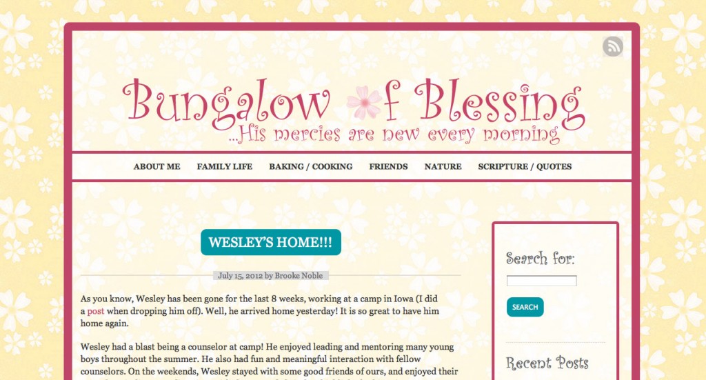
For those of you who have been following my blog for at least a month, you’ve probably seen some changes in the design. Now this is credited entirely to my brother, Wesley. I had asked him to make my blog look a bit more grown-up while retaining its playful, light, feminine colors. He readily agreed to take on the challenge! Here is what my blog looked like initially:
And, well, I guess you don’t need a screenshot of the updated version now, do you? :)
Wesley is very gifted in the area of creativity and design (as I am not), so I completely trusted him to revise my blog. Here are a few things he has done:
– Lightened the yellow color, making it a bit paler and “dusty” in color.
– Removed the hard reddish lines around the edge – I think it creates a more “open” look.
– Framed each picture with a soft gray color.
– Added widgets to my sidebar!
– Redesigned the header at the top, giving it a new font.
– Added the “LinkWithin” widget. This is amazing. For all of you fellow-bloggers out there, you should seriously consider getting this widget. It’s not a scam, it’s free, and very easy to install. I even use it sometimes when I visit my own blog! :)
….and he did a whole bunch more things I don’t even know about! Thank you, Wesley! I’m blessed by you in so many ways, including your being my continuous “tech support”!

Hannah
August 22, 2012I really, really love your new blog design, Brookie! One of my favorites was the LinkWithin widget. :) I visit so many blog posts that I wouldn’t normally. Great job, Wesley!
Becca
August 22, 2012It really looks nice, Brooke! Your brother did a good job. :)